
Key Notes for Content Creation, Design, and Creative Review
Original Publish Date: 01/28/2026 by Aja Celka
Last Edited on: 01/28/2026 by Aja Celka
These notes are to be used as a guideline & to reference before sending creative designs for review. It is also to be used as a guide while reviewing content and ensuring quality content.
Below are key call-outs to keep in mind and follow while creating content
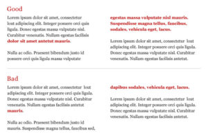
1. NO Widows
What is a widow? A single word or short line of text that appears alone at the end of a paragraph or column, but is forced to the beginning of the next page or column. This disrupts the flow of the text and can make the page look unbalanced.
Example:

2. Avoid Em Dashes
What is an em dash? A long dash (—) used in punctuation
Why to avoid em dashes? Em Dashes SCREAM AI. Chat GPT uses it in everything. We do not want it to appear that we have not written something ourselves.
IF Em Dashes happen to be used please make sure there is a space before and after it
- Good: Em — Dashes
- Bad: Em—Dashes
**Especially within social editorial calendars, only use em dashes 2 – 3% of the time**
3. Look for Poor Line Breaks
What is a line break? The process of breaking a line of text and starting a new one.
Poor line breaks disrupt the visual flow and readability of the text especially in headers and subheadings.
Examples:
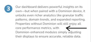

*Disclaimer: The green box is correct for a better line break but do not end lines with prepositions
4. NO Prepositions / short words at end of lines
Please do not have any hanging prepositions. This means do not end a line with a preposition.
Examples of prepositions:
- to, by, at, for, in, on, of, as, for, per…. etc
Examples of short words:
- the, are, and, but, A, an, well…. etc
KEY NOTE:
Rephrasing – If you find yourself in a situation where you are breaking a line with prepositions (or short word) or ending a line with prepositions (or short word), try to recraft the headline / subhead to not include prepositions entirely
Example:
❌ A: What Designers Are Obsessed With
✅ B: Designers’ Latest Obsession
5. Line Count Consistency
Please be aware that throughout a creative, line count should be consistent.
Example:
Notice how the icons for 1-3 are 3 lines, and on number 4, the icons have 3 lines. This is not consistent.


6. Consistent Capitalization
Similar to line consistency, please ensure that capitalization is consistent throughout social editorial decks, infographics, flyers, sliders etc. If all sections are capitalized and one section is not, that is not good & vice versa. Keep it consistent!!
❌ Bad Example:
- Refreshed, Glowy Skin
- Results in as little as 2 days
- New Year For New Skin
Bullets 1 & 3 are capitalized throughout. Bullet 2 only has the first letter capitalized.
✅ Good Example:
- Refreshed, glowy skin
- Results in as little as 2 days
- New year for new skin
7. Imagery Details
Ensure that imagery incorporating people does not involve them looking outside of the creative but rather facing inward.
❌ Bad Example:
Facing off the page

✅ Good Example:
Facing inward

8. Z Line
What is the Z line? Readers digest content in the form of a “Z” (left to right, drop down, left to right) so key points and design need to keep this in mind
*Mostly in infographics and UX design (longer format creative elements)*
9. V Design of Copy
While making creatives, more specifically social posts, it is best visually to have the top line be the widest line.
Example of V shape copy:
In the header, the top line is longer than the second line.